Visit to The Malings in Newcastle upon Tyne by Ash Sakula

The Malings, Newcastle upon Tyne - Ash Sakula

A couple of weeks ago Luke was up in Newcastle-upon-Tyne and whilst there visited the area around the Ouseburn Valley. Historically the valley was the cradle of industrialisation in Newcastle with activity focused around the tidal River Ouse and has a history stretching back as far as the Roman period. The area is currently being slowly regenerated after being left in a post-industrial malaise for a lengthy period.

The architects Ash Sakula have been involved in the valley and the local community for over 10 years. The most obvious result of this work to date is the Malings - a residential development near the mouth of the Ouse where it enters the Tyne. 

The Malings, Ouseburn - Ash Sakula
The Malings - Ash Sakula
The Malings, Newcastle upon Tyne - Ash Sakula

There are several housing types arranged into a series of splayed terraces running down the slope of the valley with pockets of public space created in-between the groupings and at the foot of the hill on the river front. There is a diverse range of housing types including courtyard houses, tower houses, terraced house and a modern interpretation of the ‘Tyneside flat’ in the stacked duplex flats. The mix of house types combined with the arrangement of the terraces on the hill creates a visually dynamic complex when viewed from the opposite side of the valley that is reminiscent of a Tuscan hill town - a Geordie San Gimigiano. 

San Gimignano (image source unknown)

The simple and robust materiality sits well in the urban context and makes the development feel at home with the surviving industry that surrounds it. The limited material palette reinforces the coherence of the architectural ensemble and avoids becoming banal with subtle shifts in the plan creating a varied fenestration pattern, variable parapet heights and slight cranks, and curves in the elevations that follow the curves of the river and hillside helping to open up the facades to the spaces carved out for public use. 

Ash Sakula - The-Malings - Third floor plan

These small spaces also have a flavour of the Tuscan hill town - the communal gardens and bike/recycling stores creating a meeting at the village well moment. The largest of these spaces in particular is so evocative that one could be forgiven for thinking they have been transported to the Piazza della Cisterna in San Gimigiano. In-between the terraces small private gardens and terraces lead onto larger shared gardens that are only accessible to the residents which again leads to a diverse range of spatial experiences contained within a cohesive overall complex.

Following his visit Luke was keen to share this project with the rest of the studio and we have all been enjoying studying the development drawings and models produced by Ash Sakula - the rough and ready cardboard model with line drawn vehicles and internal lights is a real thing of beauty! 

Ash Sakula - Malings
The Malings Model - Ash Sakula

Ash Sakula’s website has lots more information about the development which can be found here: https://www.ashsak.com/projects/malings

Workshop for the Courtauld Institute of Art

IMG_7222.JPG

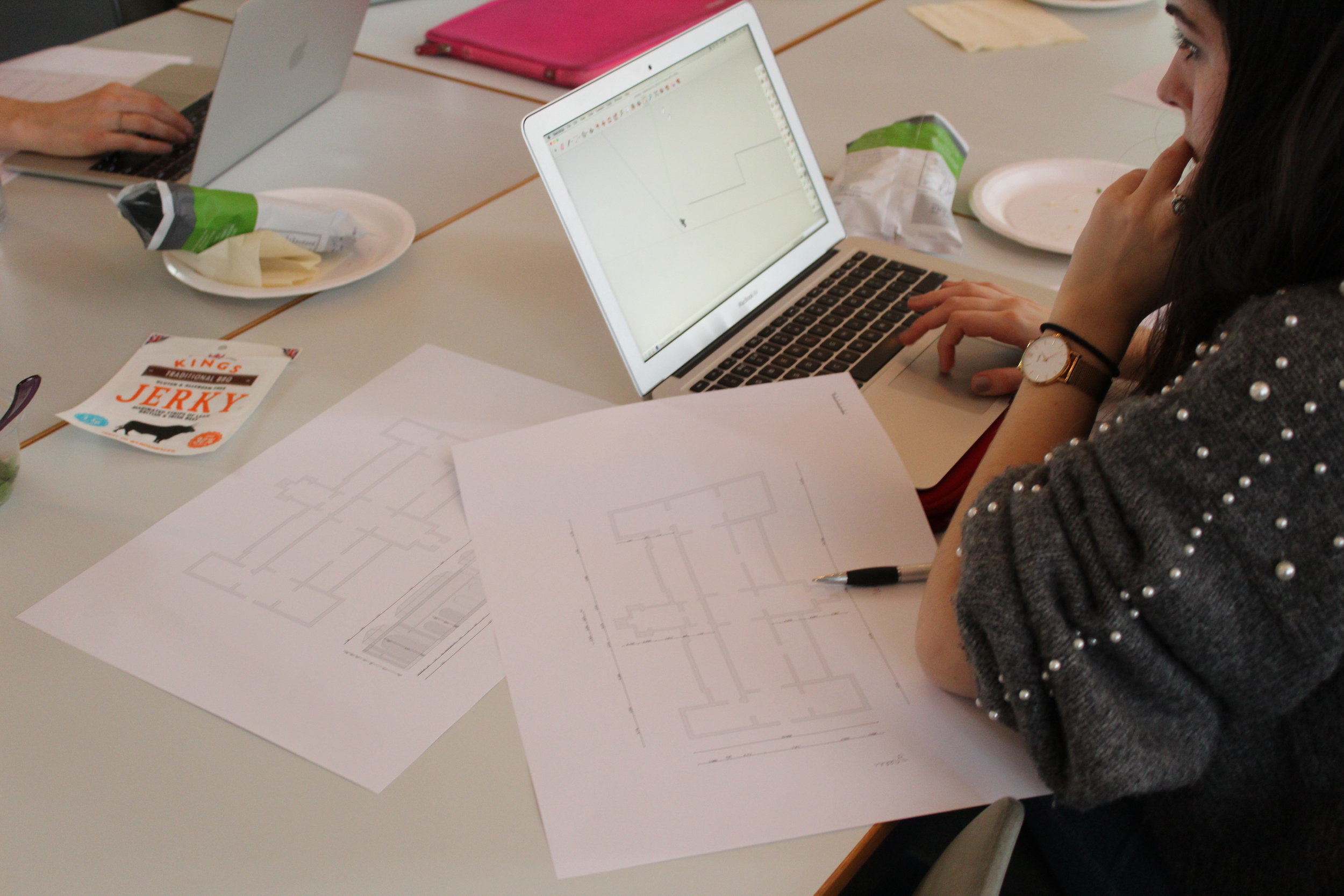
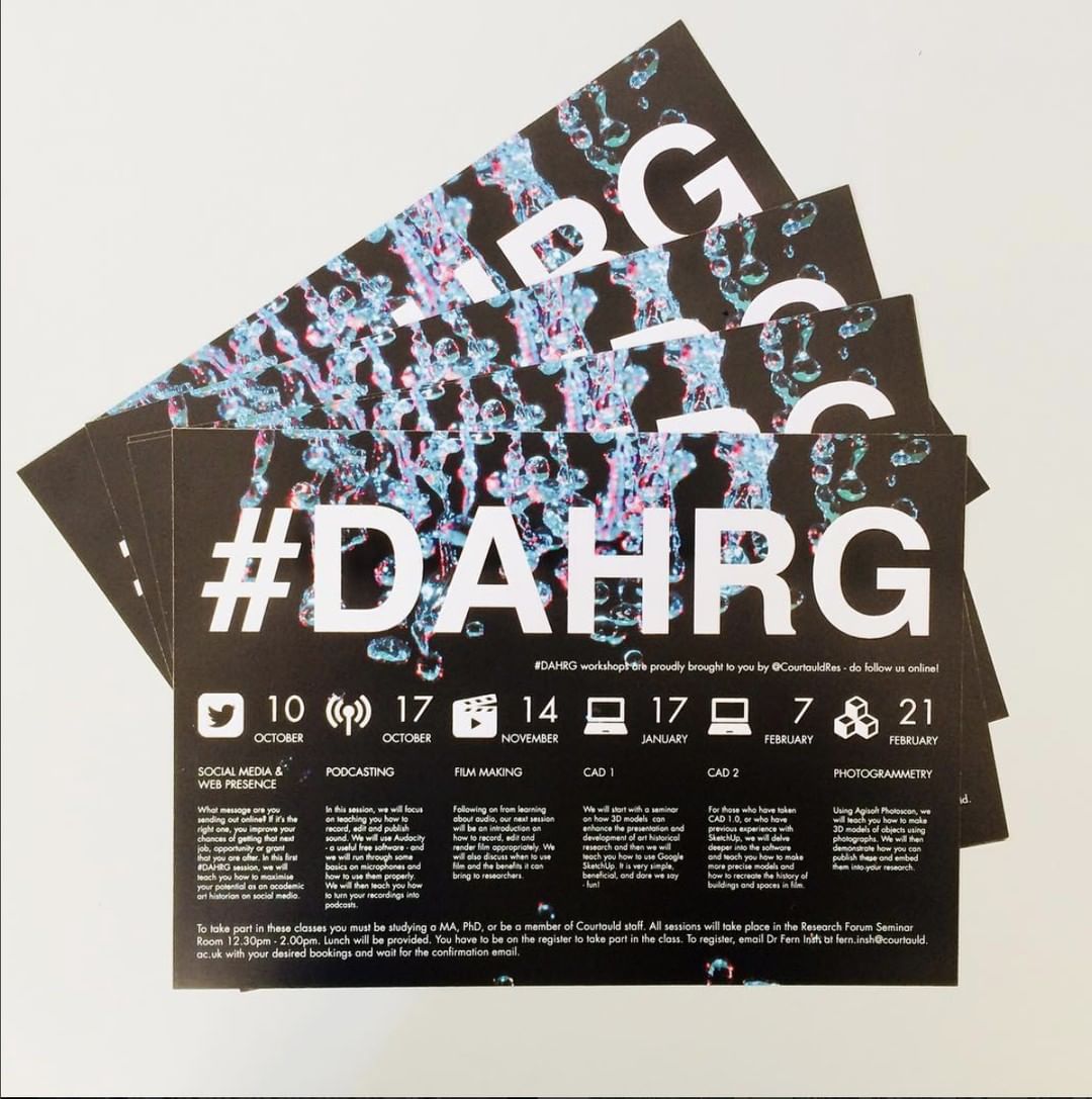
Recently Luke ran a workshop introducing the use of 3D modelling to a group of Art Historian students at the Courtauld Institute of Art. The workshop was part of a series organised by the Digital Art History Research Group led by Dr Fern Insh.

Firstly the workshop covered the use and production of scale drawings and methods of surveying buildings before getting the students to model the Dulwich Picture Gallery by John Soane using Google SketchUp. Dulwich Picture Gallery was chosen as a building of huge historical significance both in architectural and art history and also for its simple geometric forms. 

IMG_7207.JPG

Soane conceived of the primary spaces within the Dulwich Picture Gallery as a series of top lit cubes using Elizabethan Long Galleries and Vanbrugh’s top lit great kitchen at St James Palace as models for his design. This simple repeated form allowed the students to quickly develop a model that could easily be identified as the Gallery whilst also allowing the more advanced students a chance to start adding more details. 

Smythson - Haddon Hall (Slide 5 from MWA Workshop at Courtauld)
Vanbrugh - St James (Slide 6 from MWA Workshop at Courtauld)
Space - Dulwich Picture Gallery (Slide 7 from MWA Workshop at Courtauld)

By the end of the workshop the students had built a massing model of the gallery, applied materials to the surfaces, geo-located the model within its terrain, learnt how to share the files and how it might be 3D printed. Some students were even able to start work on modelling the interiors and learnt how accurate scale objects could be made to represent paintings and statues that could be moved around in the space which would be a useful tool for curators. 

MW Architects - DAHRG Workshop

For more information on he DAHRG at the Courtuald Institute of Art visit:

https://courtauld.ac.uk/research/research-forum/research-groups-and-projects/digital-art-history-research-group

42478520_310777319721462_3183773580794619661_n.jpg


January 'Shop Window'

To coincide with the revamp of our planters we decided to install a new shop window display. As we are all mightily impressed with Barry’s gardening skills we though our window display ought to showcase some of our recent buildings in gardens.

January 'Shop Window' Buildings in Gardens by MWArchitects

The two projects showcased are the ‘Greenwich Garden Studio’ and the ‘South Downs Sitooterie’. More details on both projects can be found on our Projects page. The window is our first full display following the festive trial hang we had for our decorations before Christmas.

MW Architects - January 'Shop Window' and Planter

Front Planter

MW Architects - Front Planter Shop Window

After moving into our new studio in Brockley towards the end of November, we have been hard at it trying to put are our stamp on our ‘shop windows’, allowing us to showcase what we do as a studio. 

Leading on from our recent festive window display during December we decided it was time to complement this by stripping back the dilapidated planters in front of our new window displays. After stripping back and clearing away, the neglected overgrown areas revealed rotted plywood bases which simply had some holes cut out to hold the existing plant pots in place.

MW Architects - Front Planter Before

We thought we could utilise and reuse the retained pallets from when we were fitting out the new studio spaces. With the addition of the pallets and some additional bracing to strengthen the existing base structure we were able to give a new lease of life to our little front garden. 

MW Architects - Barry hard at work on Front Planter
MW Architects - Barry using palettes to remake planters

One of the issues with the existing planter was poor drainage. To tackle this by cutting pallets to fit with the pallets running front-back, lining the base using a weed check 50gsm provided a natural gully in between while adding a layer of gravel over this should offer a suitable drainage system. On top of this, we added a layer of composite and layer of topsoil finished off with wood bark chippings around the plants.  

Sketch 01 - MW Architects Planter
Sketch 02 - MW Architects - Planter

Barry is our head gardener and sourced a selection of shrubs, ferns, coloured heather, ivy and conifers positioned carefully to utilise the varying soil depths of the planters due to the natural slope. 

We are really pleased with the results, happy to have recycled some of the waste material from our fit out and Barry has already set his sights on the next outdoor project which will see the landscaping of the side plot re-landscaped! Watch this space! 

MW Architects - Planter being planted by Barry
MW Architects - Head Gardener Barry
MW Architects - Front Planter

Christmas Party - Wreath Making Workshop

Just before we all broke up for the Christmas holidays we had a party at our new studio. Part of the reason we are so excited at the new studio space is that it provides us with room to be a little more hands-on and practical - for example we now have a dedicated area to make models, a great surface for printing inks on and even room to set up the drawing board!

MWA Wreath
MWA Wreath
MWA Wreath

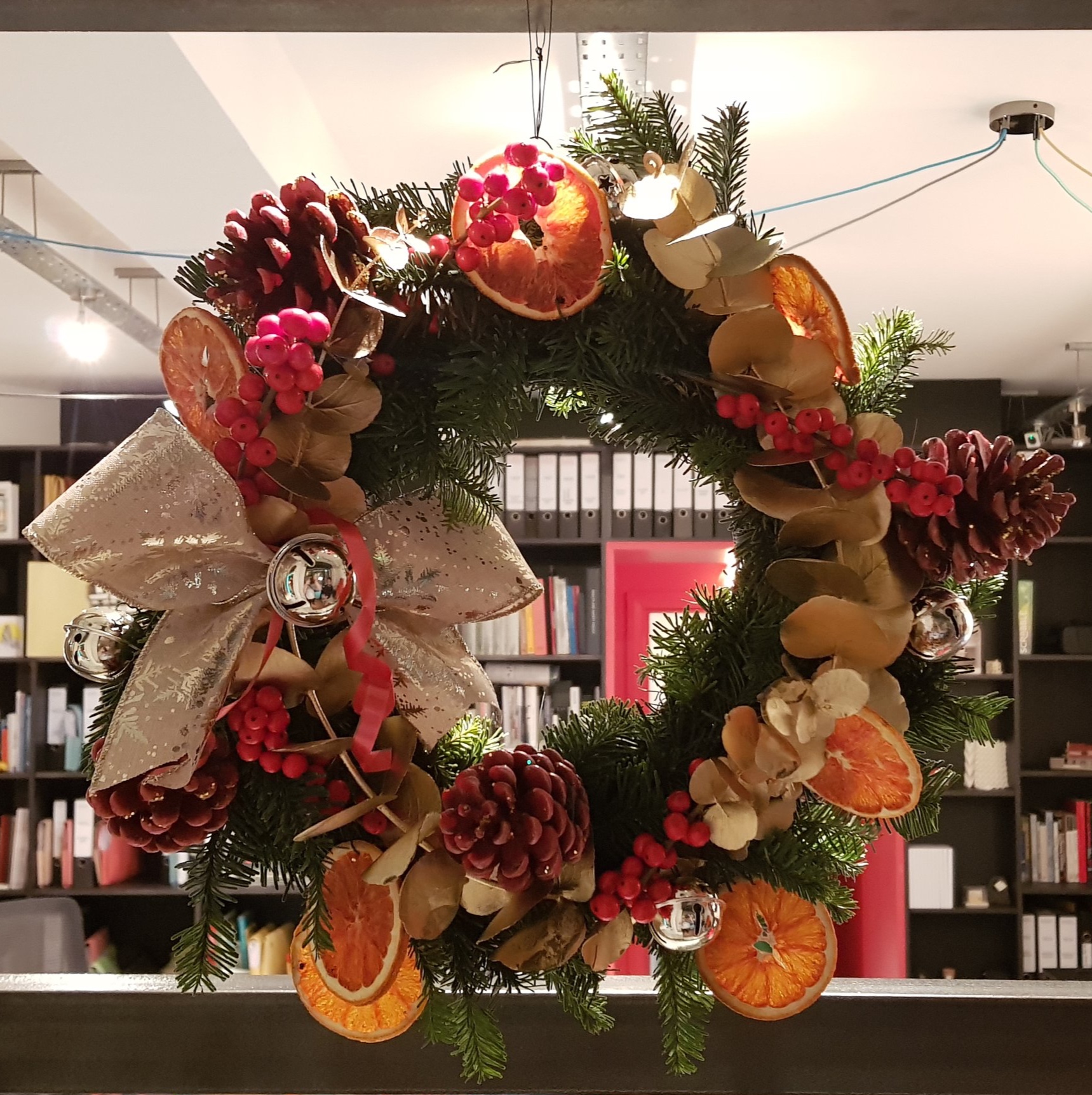
We thought that a good way to celebrate Christmas in the new studio and provide a first opportunity for ‘making’ would be to have a practical Christmas party. So we invited the wonderful artist and florist Grace A Williams to our studio to run a wreath making workshop. Her work is closely tied into the crafts, practices and industries traditionally thought of as being in the female arena and floristry has been a part of some of her pieces in the past, for more information on her work please visit:

https://www.grace-a-williams.com

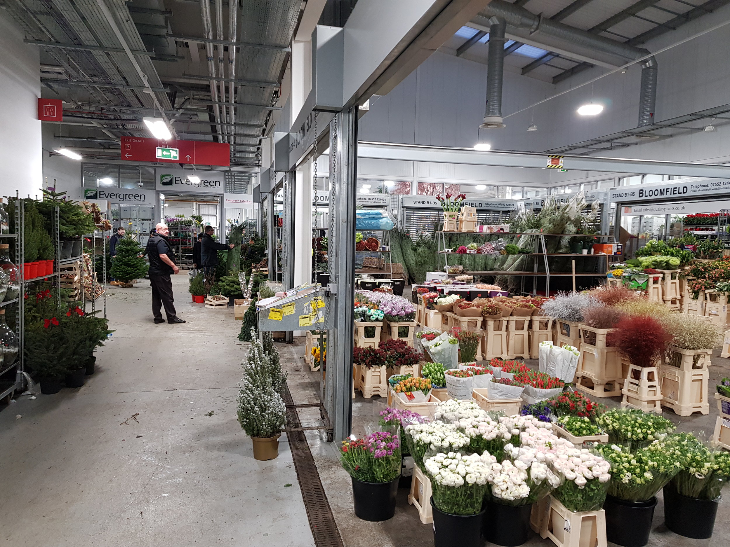
New Covent Garden
New Cover Garden
Borough Market

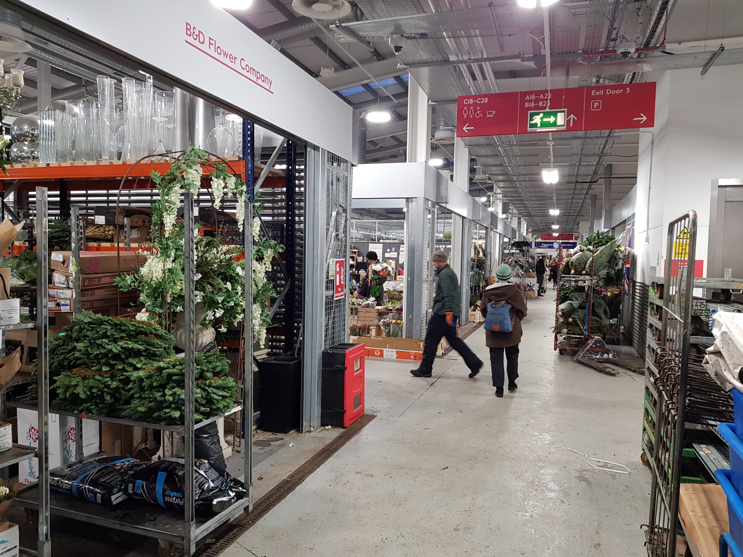
The day started early at the New Covent Garden flower markets in Battersea to buy the raw materials - a bustling working market full of boisterous characters and good cheer. Then onto Borough markets to pick up the other raw material required for a Christmas party - food and booze - before heading back to our studio for the workshop.

Whilst we were all novices and starting from scratch was a lot harder than it first appeared, over the course of a few hours we had a great laugh and produced some very fine looking wreathes to adorn our front doors and tables over the holidays. A few pictures can be found here:

Grace A Williams leading MWA Wreath Making
MWA Christmas Wreath Party
MWA Barry and his wreath

Studio 'Shop Window'

MW Architects - Christmas Shop Window

One of the things we are most excited about at the new studio is our ‘shop windows’. It has made a big difference to the atmosphere within the practice to see the world go by during the day and we really want to start a rolling series of window displays to give something back to the street scene in our new home.

With Christmas being the first major occasion since moving in it was decided the first scene for the window display should be a festive feature.

MW Architects - Business Cards

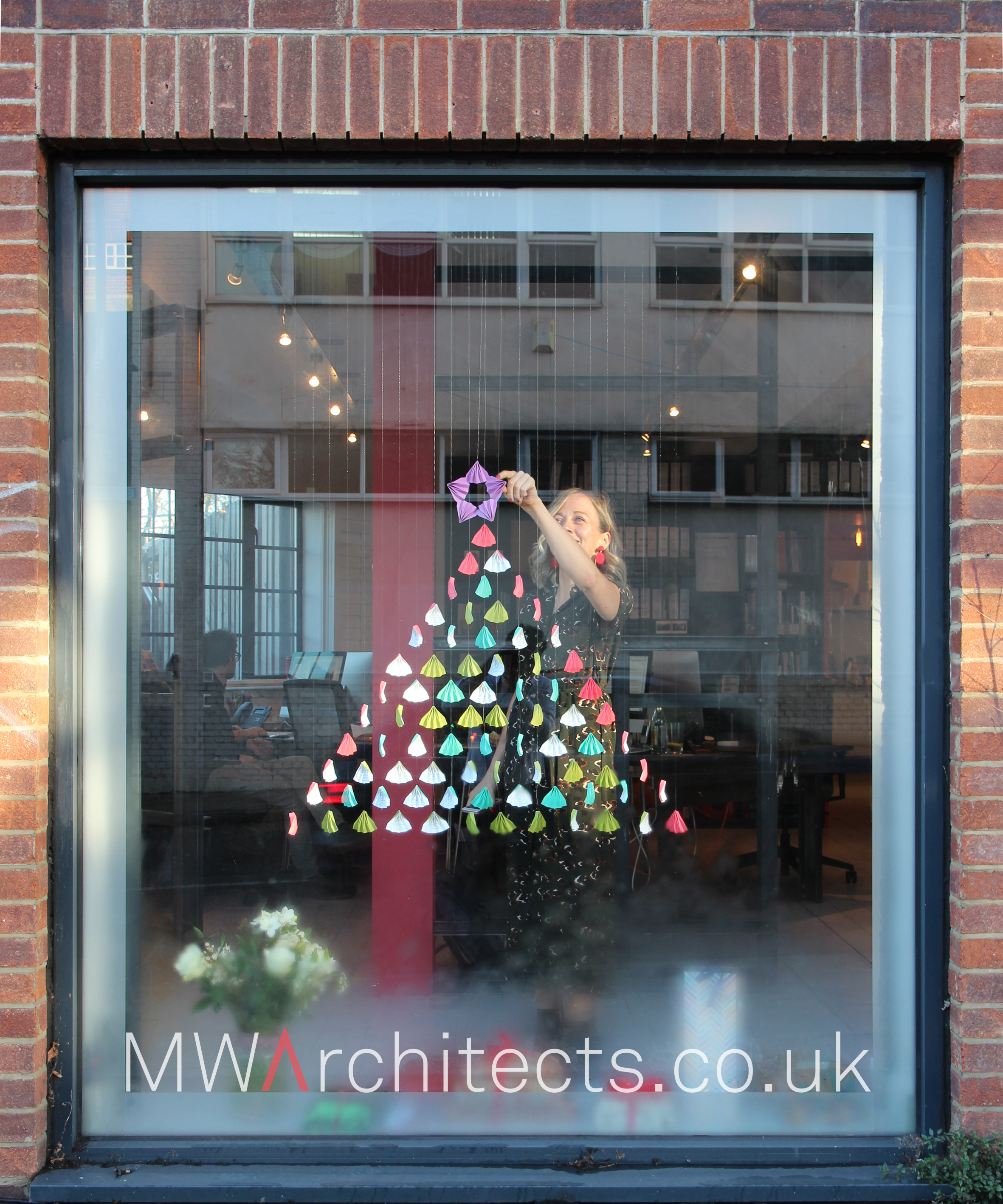
Earlier in the year we had a rebranding exercise that resulted in our fabulous new website and some rather funky business cards that are inspired by origami techniques. Unfortunately since moving our surplus business cards became defunct due to the change of address but Clare had the idea to use them to create a series of mobiles within the window. One window features falling snow and business card stars whilst the other window has a minimal business card Christmas tree.

We think the results are very cool and a really good re-use of our old business cards that would otherwise have been thrown away. It has been particularly enjoyable to see passers-by come and press their noses right against the glass to take a closer look which hopefully is a good sign for future window displays; Watch this Space!

Clare making a business card Christmas Tree
Christmas Front Door - MW Architects
Christmas Shop Window - MW Architects
MW Architects - The Visit of Secret Santa

We have moved - first pin up in new studio!

First Pin-Ups in new studio

We have made the move from our old offices in London Bridge to our own studio in Brockley. We are very excited to be in our new space and look forward to exploring the potential opportunities being here may provide. We’ve already had a few pin ups around the meeting table - here is Luke presenting a little taste of some of the work his students have been doing at Birmingham School of Architecture to the rest of the team.