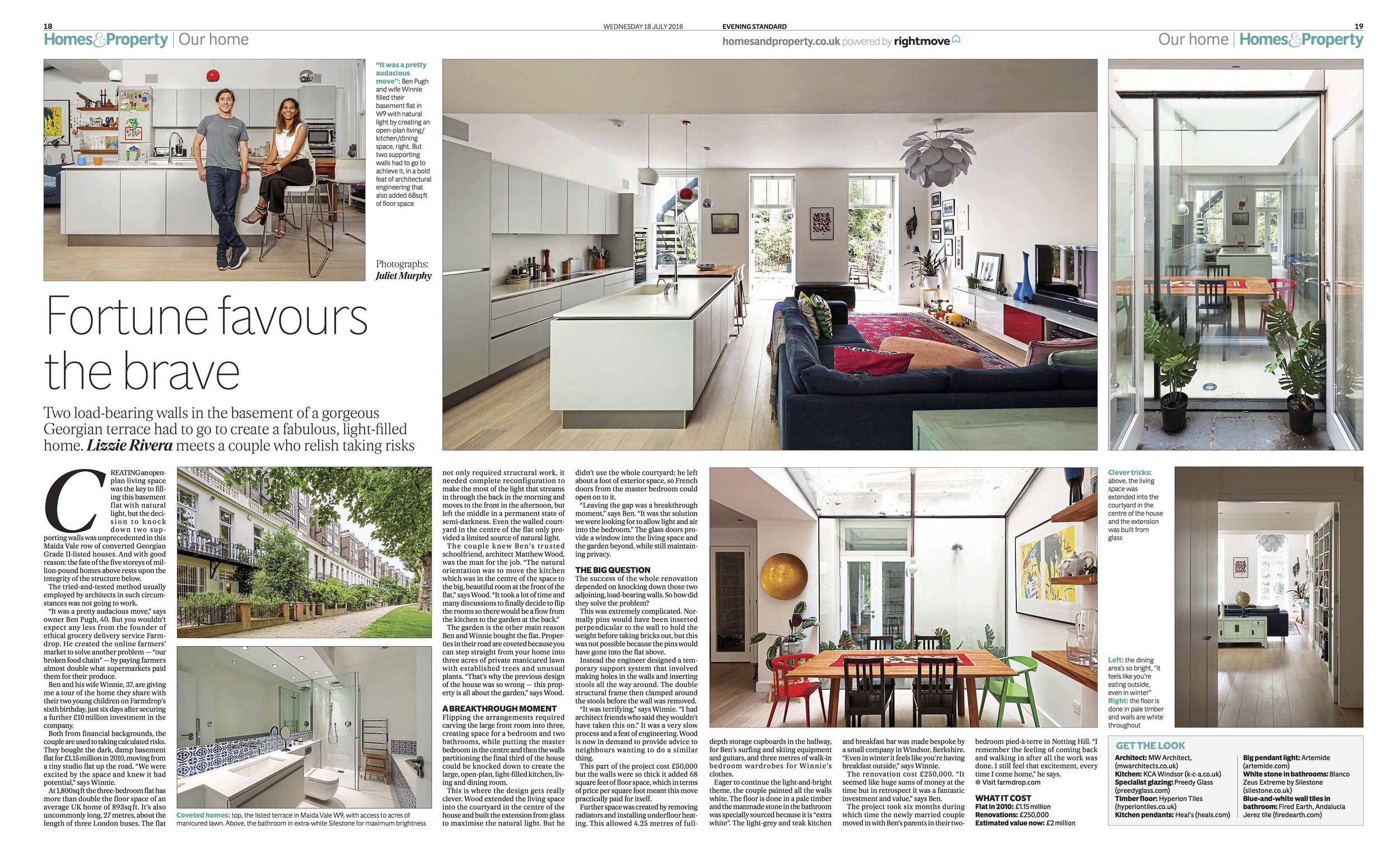
MW Architects wins Ultimate Luxury Bathroom Design of the Year 2018!

Recently our Luxury Master Suite (see: https://www.mwarchitects.co.uk/blog/2018/7/9/master-suite) won the Ultimate Luxury Bathroom Design of the Year category at the Designer Kitchen & Bathroom Awards 2018. 

We were delighted that the judges recognised the careful process of keeping the spatial design fairly simple to allow the natural quality of the materials and the skilful craft of their assembly to be the main event. 

Here is what the judges had to say about the design:


The Luxury Bathroom category is always a great pleasure for the judges because for the designers it’s a test - having a huge budget doesn’t necessarily mean great design. What we saw this year is what I would describe as restraint. It is hard if you have a huge budget to exercise restraint…the projects we enjoyed and got through the shortlist were the ones where the money had been spent on the materials and then the materials were left to speak for themselves. 

The winner of the Luxury Bathroom category actually stood out to us as being a superb use and control of light and space and materials. The materials were so beautifully selected and so fabulously executed that they also enhance the use of the space, they create an ambience in the space that is warm but I would say it is contemporary. So the bathroom really is exuberant, and it is luxurious.


New Studio Space taking shape

There are exciting times ahead for MW Architects as we are about to move into a new studio space in South East London. We are currently hard at work fitting out the new studio to provide it with desk spaces, a meeting area, a kitchen and a model making workshop. We are super excited about the move and the impact working in the new space will have on the way we operate. Watch this space for news on our new studio which will be unveiled in the next few weeks. 

New Architects 3

New Architects 3 is the definitive survey of the best British Architects to have set up practice in the ten years since 2005. The third book in the Architecture Foundation's highly influential series, it feature close to 100 practices, selected by a jury of leading critics and curators. As a portrait of the emerging talent in one of the worlds most consistently influential architectural cultures, New Architects 3 casts light on the future of architecture in the UK and beyond. The book features more than 450 illustrations of the selected practices' work and is introduced by the Pritzker Architects Prize laureate, Norman Foster. 

We were extremely pleased that we were able to share some of our work alongside some of Britains other best young architecture practices. We were able to share briefly our Essex Mews and Cecelia Road projects, which you can check out fully on our projects page. 

The Housing Design Handbook

by David Levitt and Jo McCafferty

Everyone deserves a decent and affordable home, a truth (almost) universally acknowledged. But housing in the UK has been in a state of crisis for decades, with too few homes built, too often of dubious quality, and costing too much to buy, rent or inhabit. It doesn’t have to be like this. Bringing together a wealth of experience from a wide range of housing experts, this completely revised edition of The Housing Design Handbook provides an authoritative, comprehensive and systematic guide to best practice in what is perhaps the most contentious and complex field of architectural design.

This book sets out design principles for all the essential components of successful housing design – including placemaking, typologies and density, internal and external space, privacy, security, tenure, and community engagement – illustrated with case studies of schemes by architecture practices working across the UK and continental Europe.

Written by David Levitt and Jo McCafferty – two recognised authorities in the field – and with contributions from more than twenty other leading practitioners, The Housing Design Handbook is an essential reference for professionals and students in architecture and design as well as for government bodies, housing associations and other agencies involved in housing.

Makeover - Conversions and extensions of homes and residential space

Makeover - MW Architects

In the world of architecture and construction there is a general consensus that many existing residential buildings will have to be substantially renovated within the next few years – not only because they are technically outdated but also because their functionality and esthetics are no lon - ger in line with contemporary demands and requirements. For each venture of this type, the owners and architects must deal and come to terms with the existing structures. Some projects consist of only a few square meters within an old building while others exceed the size of the previ - ously existing living space.

Based on more than 100 carefully selected works, the whole scope of possibilities for extensions and conver - sions is presented – from multi-floor annexes, via newly designed existing spaces, to additional sections or merged spaces. Some of the interventions are understated, while others are preeminent, utilizing matching or contrasting materials, and exhibiting a great variety of different styles – whether minimalist, rustic, elaborate, elegant ..

IMG_3385.JPG

(Description from athour)

Why is a budget so important to us?

Clapham house was a whole house refurbishment with lower-ground and ground floor extensions, made successful through the detialin of costs to the client. 

Clapham house was a whole house refurbishment with lower-ground and ground floor extensions, made successful through the detialin of costs to the client. 

At MW Architects we pride ourselves with being able to offer every client a detailed predictive bottom line cost from the earliest stage of the project, sometimes even before we visit site. We believe that this helps us to maintain a happy relationship with our clients, as being clear and upfront with the projects costs eliminates the shock factor later down the line. Having successfully completed projects from £100k to £3m we believe that this philosophy should be applied to every project to ensure that we can help you realise your vision while staying within budget. 

Melissa Robinson, Director at MW Architects, went into further detail about what we do and how 'Giving clients the bottom line makes for happier projects', with the RIBA following a pecha kucha on the topic at the RIBA Guerilla Tactics Conference in November 2017. If you want to find out more then head over to the RIBA article and have a read for yourself. 

RIBA Article - https://www.architecture.com/knowledge-and-resources/knowledge-landing-page/giving-clients-the-bottom-line-makes-for-happier-projects


Luxury Master Suite

This project in NW3 was a brand new home for a previous client.  Having inherited a planning permission for the site from the previous owners, external works were limited to the approved envelope and style but the inside provided a canvas for the clients to display their personalities all the way through the home.

With a generous 750 SQM floor plan, spaces were able to be given more area than in other smaller homes.  This led to grand connected spaces at all levels.

On the first floor, the Master Suite is the epitome of private luxury with a 90 sqm bedroom, bathroom and dressing area across the entire south facing rear of the property behind a large double door from the main hallway.

With a central Juliette balcony the bed sits against a bespoke back-lit bedhead wall with inbuilt side tables and reading lamps and lights floating above.  This opens up onto a large dressing area with a set of corner cupboards and a central dressing unit.

Walking around to the bathroom there is a suggestion of what is to come as large slabs of contrasting marble ‘peek out’ into the passageway.  The design here is based on a series of slabs rising from floor to ceiling in contrasting and inverted marbles to create distinct spaces for the functions of the room as well as to define ‘his and her’ spaces. 

As you enter the bathroom you are greeted with Panda White book-matched marble slab denoting ‘her’ dressing area with a sink unit on the reverse.  Facing onto this is ‘his’ sink area on a Black Moon book-matched marble slab.  Behind this slab is a 2.5m walk through shower and separate ‘his and hers’ toilets behind the final partition.

The marbles were carefully selected to be as close to a perfect invert of each other as possible, with the monochrome adding to the impressive contrast.

The floor-to-ceiling slab partitions are set to be perpendicular to the rear wall and window allowing light to flow into the entire bathroom space.  The striking pebble free-standing bath floats harmoniously in front of one of the windows.  The effect is a dramatic yet very functional bathroom space.

Materiality was of high importance throughout with the suite flooring in timber parquet throughout allowing a real sense of continuing space -  the only break in this is for the walk through shower slab.  White plastered walls are used in all spaces to allow the materials to be visually prominent.  A dark grey stained oak is used on the bedroom furniture with the bedhead being a painted softwood and a bespoke construction built in situ. 

Acle Bridge Visitor Centre Competition - Norfolk Broads

We recently entered into a competition to design the new visitor's centre at Acle Bridge, in the Norfolk Broads. We were given the task of designing a canal side visitor centre that provided cafe space, facilities for mooring boats, an education space and an exhibition area in order to educate visitors about the history of the Norfolk Broads and the importance of water. The building was also to be designed in order to take advantage of the surrounding landscape, the largest protected wet land in the UK. 

We approached this project, designing what we hoped had the ability to be a landmark building for the Norfolk Broads Authority. Being in such a significant part of the country we took inspiration from one of the greatest pieces of architecture found in the Norfolk Broads, the wherry boat. We wanted to capture the wind filled sails that can be seen cutting through the reeds of the Norfolk broads in a solidified structure but in an abstracted manner. Due to the organic shapes created by the sails we thought it would be counter productive to begin with computer modelling. Instead, we started our

investigation using craft rock to create organic 'sail like' shapes. We were then able to establish numerous roofing schemes that we could use in the design of our building.

The result, we believe, is one that answers the brief while delivering a unique piece of architecture and in some way a part of the Norfolk Broads, in building form. We have proposed a collection of 'sail like' swooping curved roofing planes which create a dramatic and spacious interior. Large expanses of glass frame the outstanding surrounds while also flooding the building with natural light, while making the building more sustainable as a result of large solar gains. The concave roof planes also serve as grey water collectors allowing the building to be serviced by the water it collects. The roofing system itself is a unique system that we invented and pioneered in conjunction with structure mode (read our blog about that here). A cnc cut, LVL structural timber, self reciprocating, double curved timber roof with a stressed skin