Blue Steel
A large Victorian property in Hampstead where the owners were keen to explore the contrast between traditional architectural features and the innovative use of contemporary materials. The brief for the main body of the house was generally to restore and reintroduce traditional details such as stone staircases, plaster cornices, timber wainscotting etc. in a sympathetic way so that the interventions MW Architects made are almost imperceptible to anyone who didn’t know the building before work started. But for the extension the client wanted something much bolder. The challenge was to create something distinctly different to the typical London stock brick box extension but whilst maintaining the characteristic of high quality materials and craftsmanship.
In the early parts of the design process MW Architects considered many possible options for how to build the extension but none of them seemed quite right. As we were pondering this one day on our way to visit the site the answer suddenly appeared to be right there in front of our nose. Along with the 2 million other Londoners who use the Tube everyday we regularly see the use of Vitreous Enamel Panels used in stations, as well as in shops, offices and so on but we had never seen it used in a private residence before and soon got excited by the possibilities.
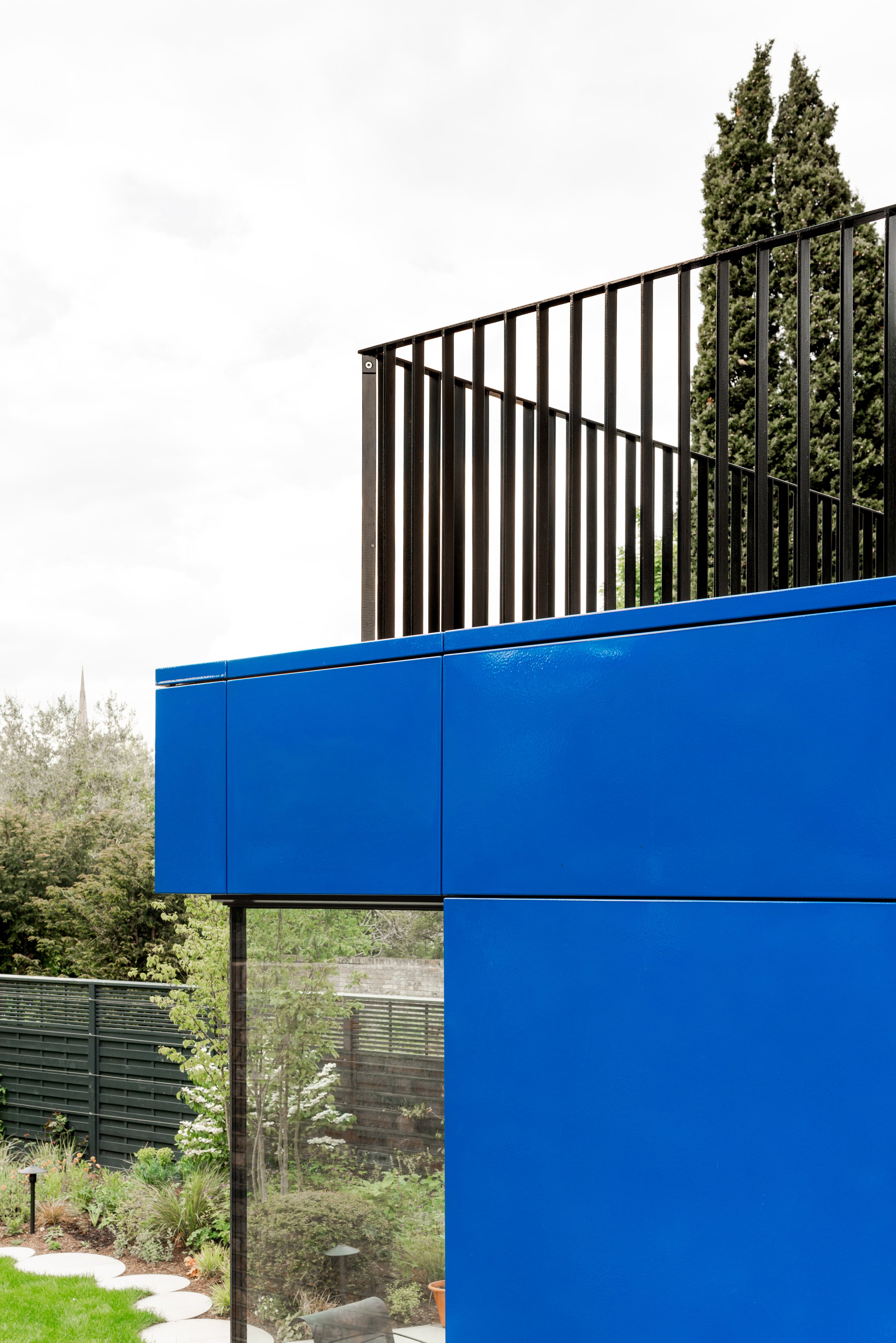
Vitreous Enamel is a material with fantastic qualities, it is robust, long lasting and easy to maintain. It can be mass manufactured and made to millimetre precision in a wide range of complex panel forms and is capable of receiving carefully controlled applied finish such as screen printed graphics. These qualities make it the perfect material for infrastructural projects and signage but we were keen to explore if we could use it in a way that married the precision of the panel forms with a finish that was a little less controlled.
Like a Saville Row suit we wanted to create something that was highly tailored to suit the form of the extension but made from a material that proudly bore the signs of the processes that made it and the slight blemishes and imperfections of a handcrafted material.
We worked closely with the fabricators Trico to develop a finish that has subtle dappling of colour tones and an ‘orange peel’ finish so that the light ripples over the surface of the panels.
The bold blue colour was chosen to act as a backdrop to the clients planting scheme but the effect of the mottled finish in both colour and texture means that in different lights and at different times of the day the appearance of the panels can vary from a deep slate grey through to an almost white. The mottled effect was created by blowing air over the enamel after it had been applied to disrupt the typically even surface of the coating.
The inside of the lowest floor is equally as playful as the blue outside with a contrasting coloured kitchen in a modern take on a contemporary style cupboard.
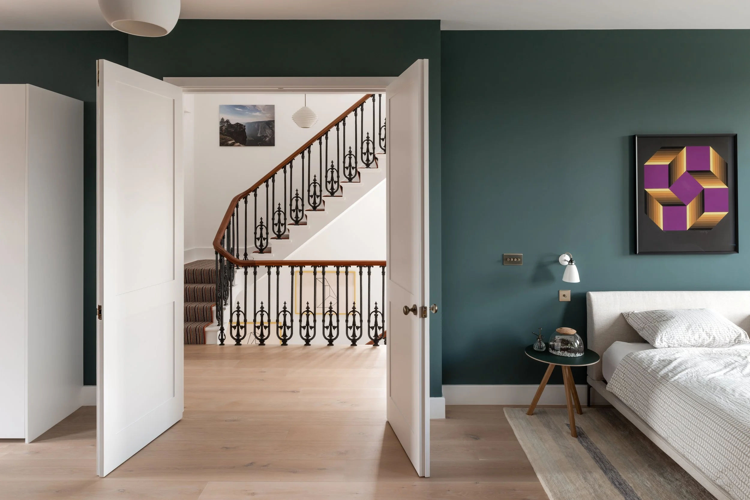
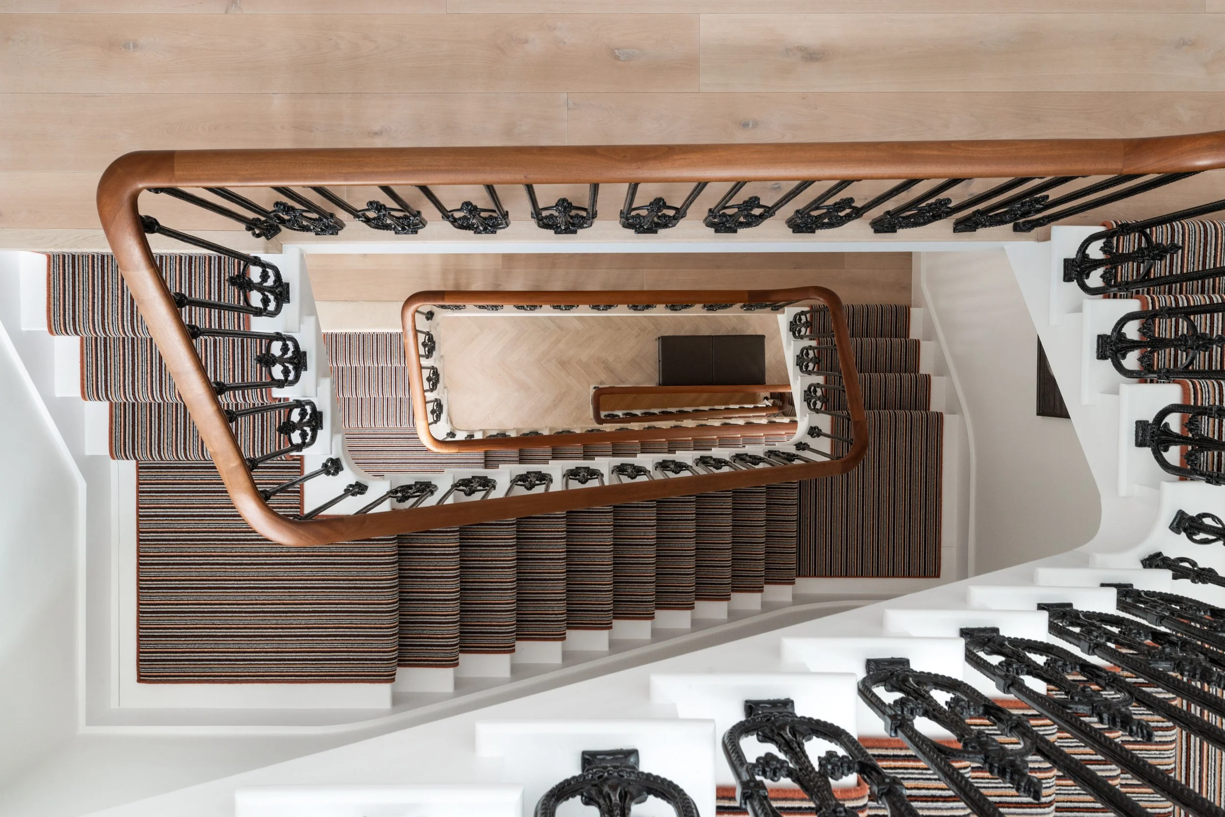
The other defining feature in the renovation was the re-instatement of a grandiose staircase to connect all five floors of the building. Initially only present in limestone from lower ground to first floor in this area of the building an additional two storeys have been added and meticulously matched to the existing - it is impossible to tell that it wasn’t always there.
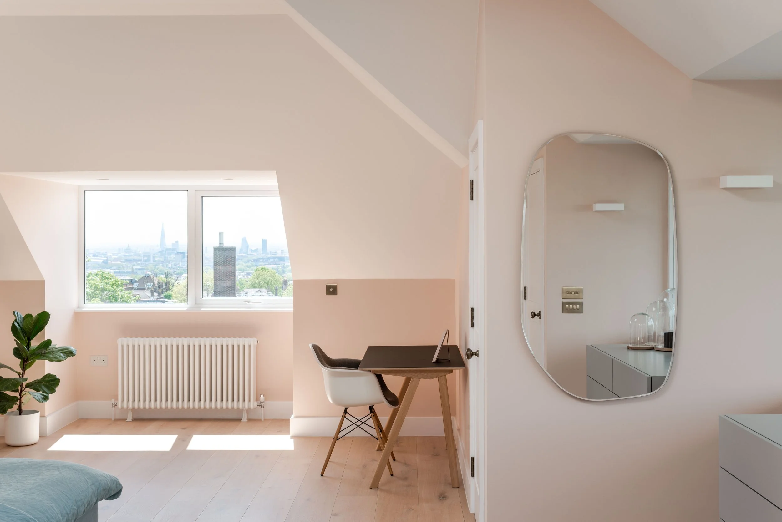
The top floor now provides an open and airy master suite with phenomenal views across the London skyline to the front and side and the village-esque Hampstead to the rear.
Existing drawings
Proposed drawings


